
In today’s crowded digital marketplace, a visually appealing website is no longer enough. The difference between a visitor who bounces and a customer who converts often comes down to their experience. One of the best ways to increase your website’s success is to enhance UX principles, ensuring that your site is as user-friendly as possible. This is where user experience design principles become your most powerful tool. These aren’t abstract theories; they are the proven, actionable foundations for creating websites that are intuitive, accessible, and persuasive.
For a small or medium-sized business in Vancouver, mastering these enhance UX principles means directly impacting your bottom line, from enhancing local SEO on Google Maps to boosting sales on your Shopify store. A seamless user journey keeps potential clients engaged, builds brand loyalty, and turns casual browsers into paying customers. To truly master the field, a deep understanding of Essential UX Interface Design Principles is foundational for effective user experience. Neglecting these fundamentals can lead to high bounce rates, abandoned shopping carts, and missed opportunities, no matter how much you invest in advertising.
This comprehensive guide breaks down 10 core principles into practical steps, checklists, and real-world examples specifically for businesses like yours. We’ll show you how to implement them to reduce user frustration, build trust, and ultimately, drive sustainable growth. If you find these concepts overwhelming or simply want a professional assessment, our dedicated team is ready to help with a free estimate. For now, if you’re ready to transform your website from a simple online brochure into a high-performing asset, let’s dive in.
1. User-Centered Design (UCD)
At the heart of all effective user experience design enhance UX principles is User-Centered Design (UCD). This framework places the real-world user at the absolute centre of every design and development decision. Instead of creating a product based on internal assumptions or aesthetic preferences, UCD is a process rooted in empathy. It involves deeply understanding user needs, behaviours, and pain points through methodical research like interviews, surveys, and usability testing. This ensures the final product solves genuine problems for its intended audience.

For Vancouver-based businesses, applying UCD means creating digital experiences that resonate specifically with local customers. For example, Shopify’s entire platform is a masterclass in UCD, constantly evolving based on merchant feedback to simplify e-commerce. Similarly, Airbnb’s success stems from its iterative redesigns based on analysing both host and guest behaviours. For a deeper dive into the methodology, consider Mastering User-Centered Design to truly build products your customers will embrace.
How to Implement User-Centered Design
Implementing UCD doesn’t require a massive budget. It requires a shift in mindset from “what we think users want” to “what we know users need.” Here are actionable steps for your business:
- Conduct User Interviews: Speak directly with 5-10 people from your target market. Ask open-ended questions about their challenges and goals related to your industry.
- Create Data-Driven Personas: Move beyond generic avatars. Build detailed buyer personas using real data from your interviews and analytics to guide every design choice.
- Test Early, Test Often: Create simple prototypes or wireframes and test them with actual users before writing a single line of code. This saves significant time and resources.
- Establish Feedback Loops: After launch, use tools like surveys, heatmaps, and customer support tickets to gather ongoing feedback for continuous improvement.
For businesses seeking to build more complex digital tools, UCD is non-negotiable. Our expertise in custom web application development is founded on these enhance UX principles, ensuring the final product is intuitive, efficient, and perfectly aligned with user workflows. If you need a dedicated team to help you apply these enhance UX principles, our professionals are ready to provide a free estimate and guide you through the process.
2. Usability & Accessibility
Beyond a beautiful interface, a product must be fundamentally usable and accessible. Usability is about creating an experience that is intuitive, efficient, and easy to learn. Accessibility ensures that this experience is available to everyone, including individuals with disabilities affecting their vision, hearing, motor skills, or cognitive abilities. This isn’t just a best practice; it’s a legal and commercial necessity, with standards like the Web Content Accessibility Guidelines (WCAG) setting the benchmark.

For Vancouver-based businesses, embracing accessibility expands your market to include significant local demographics like elderly populations and users with disabilities. The Government of Canada’s websites, which must meet WCAG 2.1 AA standards, are a prime example of this principle in action, ensuring all citizens can access vital services. Tools like the WAVE Web Accessibility Evaluation Tool allow you to check your site’s compliance, while frameworks like Microsoft’s Inclusive Design guide the creation of universally usable products from the ground up.
How to Implement Usability & Accessibility
Integrating usability and accessibility is a core part of the design process, not an afterthought. Adhering to these user experience design enhance UX principles makes your product better for everyone. Here are actionable steps for your business:
- Audit Your Website: Use automated tools like WAVE, Axe DevTools, or Google Lighthouse to identify immediate accessibility issues like missing alt text or low colour contrast.
- Prioritise Keyboard Navigation: Test your entire website using only the tab, enter, and arrow keys. Ensure all interactive elements like links, buttons, and form fields are reachable and usable.
- Write Clear and Descriptive Text: Use alt text for all meaningful images to describe their content for screen readers. Ensure all form fields have clearly associated labels and provide helpful error messages.
- Maintain Colour Contrast: Use a contrast checker tool to ensure your text and background colours meet the minimum WCAG AA ratio of 4.5:1, making your content readable for users with visual impairments.
For businesses looking to ensure their digital platforms are fully compliant and user-friendly, this can be a complex task. Our team is equipped with the expertise to conduct thorough accessibility audits and implement necessary changes, ensuring your website serves the widest possible audience. If you need a dedicated team to help you apply these enhance UX principles, our professionals are ready to provide a free estimate and guide you through the process.
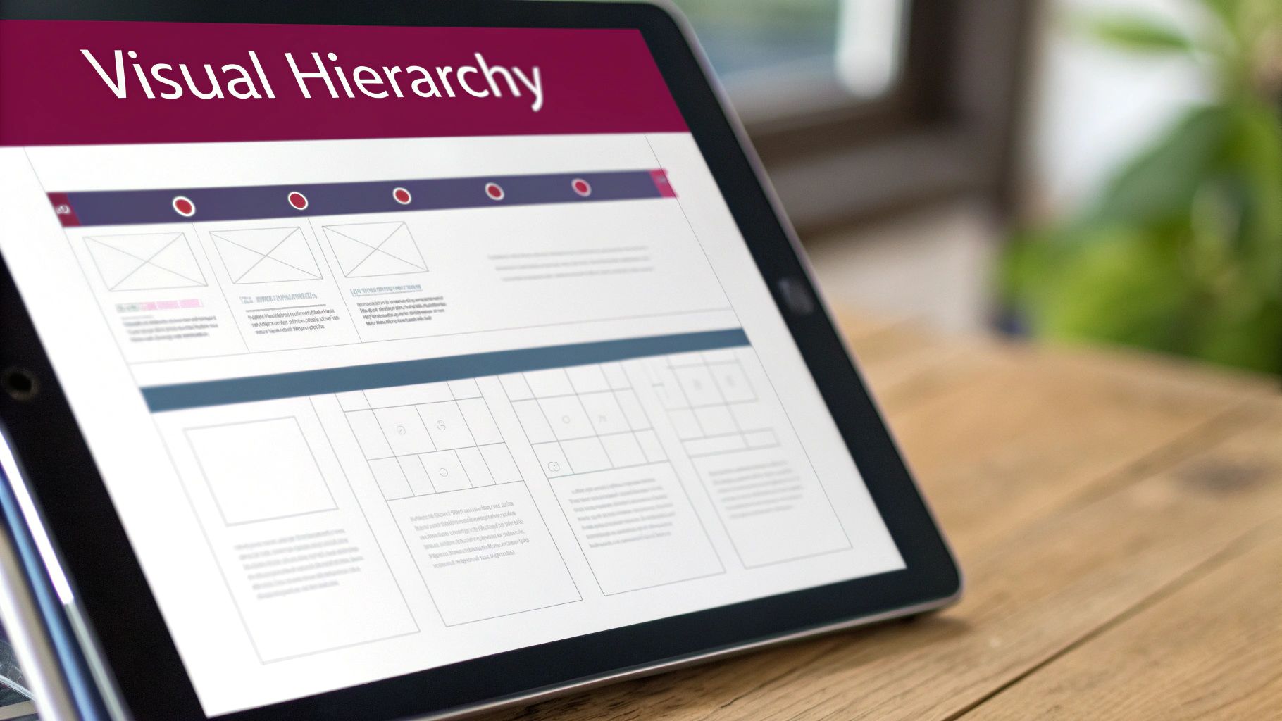
3. Visual Hierarchy & Information Architecture
Visual Hierarchy and Information Architecture (IA) are foundational user experience design principles that bring order to digital chaos. It is the art of arranging interface elements to clearly communicate their importance. It uses signals like size, colour, spacing, and typography to guide the user’s eye to the most critical information first. Paired with this, IA is the science of organising and structuring content in a logical, intuitive way. Together, they ensure users can effortlessly understand a page and find what they need, which is essential for engagement and conversion.
Excellent examples are found across the web. Stripe’s pricing page uses a clear hierarchy to make complex plans easy to compare, guiding users toward a decision. Similarly, Apple’s product pages employ a minimalist hierarchy with bold headlines and strategic call-to-action buttons that stand out. For local Vancouver businesses, optimising a Google Maps listing involves organising key information like hours, address, and phone number so they are immediately visible. This deliberate structure prevents user frustration and reduces bounce rates.
How to Implement Visual Hierarchy & IA
Implementing these enhance UX principles involves strategic planning rather than guesswork. It’s about designing with purpose to direct attention and simplify navigation. Here are actionable steps for your business:
- Follow Natural Scanning Patterns: Design layouts that align with F-pattern or Z-pattern reading behaviours. Place your most important calls-to-action (CTAs) and value propositions where users naturally look first.
- Use Size and Colour Strategically: Make headlines significantly larger than body text. Use a consistent, high-contrast colour for all clickable elements, like buttons and links, to signify interactivity.
- Organise Navigation Logically: Limit your main menu to 5-7 primary categories to avoid overwhelming users. For Shopify stores, this means creating clear product collections that make sense to your customers.
- Prioritise Key Business Information: Local businesses must place contact info, hours, and their address “above the fold” or in a highly visible footer. Make it as easy as possible for customers to connect with you.
A strong hierarchy is a non-negotiable part of modern website design, as it directly impacts usability and sales. If you need a dedicated team to help you structure your digital presence for maximum clarity and impact, our professionals are ready to provide a free estimate and guide you through the process.
4. Mobile-First Design
Mobile-First Design is a strategic approach that prioritizes designing for the smallest screen first, then progressively enhancing the experience for larger devices like tablets and desktops. With over 60% of all web traffic now coming from mobile devices, this principle ensures your digital presence is optimized for the majority of your audience. This isn’t just a trend; it’s a fundamental shift in how successful websites are built, forcing designers to focus on core content and functionality from the very beginning.

For Vancouver businesses, a mobile-first approach is crucial for capturing local search traffic. Think of how often customers use Google Maps to find a local service; that entire journey happens on a smartphone. Google itself reinforces this with its mobile-first indexing, meaning it primarily uses the mobile version of a site for ranking. Platforms like Shopify have perfected this, with streamlined mobile checkouts that reduce friction and boost sales. Adopting this as one of your core user experience design enhance UX principles is no longer optional for growth.
How to Implement Mobile-First Design
Implementing a mobile-first strategy means shifting your design process to start with the most constrained environment, which leads to a more focused and efficient user experience across all platforms. Here are actionable steps for your business:
- Prioritize Content Ruthlessly: On a small screen, you must identify and display only the most critical information. For a local business, this means your phone number, address, and hours should be instantly visible.
- Design for Touch: Ensure all buttons and links are large enough to be easily tapped with a thumb. Increase padding around interactive elements to prevent accidental clicks.
- Optimize for Performance: Mobile users expect speed. Compress images using modern formats like WebP and aim for load times under 3 seconds on a 4G connection to reduce bounce rates.
- Test on Real Devices: While emulators are useful, nothing beats testing your site on actual iPhones and Android devices to understand the true user experience, from readability to navigation.
Building a truly effective mobile-first website requires technical expertise and a deep understanding of user behaviour. Our team specializes in creating responsive designs that look and perform beautifully on every device. If you need a dedicated team to help you implement these enhance UX principles, our professionals are ready to provide a free estimate and guide you through the process.
5. Consistency & Design Systems
Consistency is a cornerstone of intuitive user experience design principles, ensuring that similar elements look and behave in a predictable way. It reduces the user’s cognitive load, as they don’t have to relearn how your interface works on every new page. A Design System formalises this consistency by creating a single source of truth: a comprehensive library of reusable components, styles, and guidelines that governs the entire product’s look and feel. This builds trust, reinforces brand identity, and drastically streamlines both design and development.
Google’s Material Design is a globally recognised example, providing a unified system for Android, web, and other platforms. Similarly, Shopify’s Polaris design system ensures every app and feature within its ecosystem feels familiar and cohesive to millions of merchants. This approach allows teams to build better products faster, as the foundational decisions have already been made. For a business, this translates directly into a more polished, professional digital presence and significant savings in development resources over time.
How to Implement Consistency & Design Systems
You don’t need a Google-sized team to benefit from this principle. The goal is to create a consistent, predictable experience for your users and an efficient workflow for your team. Here are actionable steps to get started:
- Establish Core Components: Begin by defining the styles for your most-used elements like buttons, forms, typography, and your colour palette. Document these foundational choices.
- Create a Centralised Style Guide: Use tools like Figma or even a shared document to create a simple style guide. This ensures every team member is aligned on visual standards.
- Use Reusable Templates: For WordPress or Shopify sites, establish consistent page and section templates. Ensure elements like product cards or blog post layouts are uniform across the site.
- Adopt a Spacing System: Implement a consistent spacing scale, like an 8px grid system, to create visual rhythm and harmony throughout your layouts.
Building a robust design system is a strategic investment in your brand’s future. Our team specialises in creating cohesive digital experiences, from initial style guides to complete custom application development. If you need a dedicated team to establish consistency and efficiency in your digital projects, contact us for a free estimate and expert guidance.
6. Feedback & Error Prevention
Effective communication is the cornerstone of a trustworthy digital experience, which is why Feedback and Error Prevention are critical user experience design enhance UX principles. This dual approach ensures users are always informed about the system’s status and are guided away from making mistakes. Feedback provides clear, immediate responses to user actions, such as confirmation messages or loading indicators. Error prevention takes a proactive stance, designing interfaces that make it difficult for users to enter incorrect data or make wrong choices in the first place. This builds user confidence and dramatically reduces frustration.
This principle is fundamental to driving conversions. Gmail’s “Undo Send” feature is a classic example of error prevention, giving users a crucial window to correct a mistake. In e-commerce, Shopify’s real-time inventory updates provide immediate feedback, preventing customers from ordering out-of-stock items. Similarly, Stripe’s payment forms use inline validation to give instant feedback on formatting errors, smoothing the path to purchase. These small interactions are vital for maintaining momentum in any transactional process.
How to Implement Feedback & Error Prevention
Integrating this principle is about anticipating user needs and communicating clearly at every step. It’s about creating a conversation between the user and the interface. Here are actionable steps for your business:
- Provide Real-Time Validation: Use inline validation on your forms to give immediate feedback. Let users know their chosen username is available or their password meets the criteria before they hit submit.
- Write Human-Centred Error Messages: Avoid technical jargon like “Error 404” or “Invalid Submission.” Instead, use plain language to explain what went wrong and how to fix it, such as, “Oops, that email address doesn’t look right. Please try again.”
- Use Visual Cues for System Status: When an action takes more than a second, use a loading spinner or progress bar to show the system is working. Use colour and icons (green checkmark for success, red ‘X’ for an error) to communicate outcomes instantly.
- Guide Users with Microcopy: Implement helpful, contextual microcopy next to form fields or buttons. A simple tip like “Must be at least 8 characters” under a password field prevents a common error.
For businesses that rely on complex forms or multi-step processes, robust feedback and error prevention are non-negotiable. Our expertise in creating intuitive user interfaces ensures your customers feel supported, not frustrated. If you need a dedicated team to help you apply these enhance UX principles, our professionals are ready to provide a free estimate and guide you through the process.
7. Performance & Speed Optimization
A critical, yet often overlooked, user experience design principle is Performance and Speed Optimization. This principle dictates that a digital product must load quickly and operate smoothly for users. In an age of instant gratification, even a minor delay can lead to frustration and abandonment. Studies consistently show that a slow website directly impacts conversions, with every 100-millisecond delay potentially reducing them by 7%. This principle is about more than just convenience; it’s a fundamental sign of respect for the user’s time.
Performance optimization involves a range of technical strategies, including compressing images, minifying code, implementing smart caching, and ensuring robust server response times. For Vancouver businesses, a fast website is non-negotiable. It not only provides a superior user experience that keeps local customers engaged but also heavily influences local SEO and Google Search rankings, making it a crucial factor for visibility and growth in a competitive market.
A prime example is Pinterest, which invested heavily in mobile performance and saw a 40% improvement in perceived wait times, leading to higher engagement. Similarly, platforms like Shopify and Webflow build performance optimization directly into their core services, automatically compressing images and streamlining code to help merchants succeed. This commitment to speed is central to a positive user journey.
How to Implement Performance & Speed Optimization
Improving your site’s speed is one of the most impactful UX enhancements you can make. It requires a technical focus but delivers measurable results in user satisfaction and business goals. Here are actionable steps for your business:
- Benchmark with Core Web Vitals: Use tools like Google PageSpeed Insights to audit your site. Aim for Google’s recommended targets: Largest Contentful Paint (LCP) under 2.5s, First Input Delay (FID) under 100ms, and Cumulative Layout Shift (CLS) under 0.1.
- Optimize Your Images: Compress images using modern, efficient formats like WebP or AVIF. Implement “lazy loading” so images below the fold only load as the user scrolls down, speeding up the initial page view.
- Streamline Your Code: Minify your JavaScript and CSS files to remove unnecessary characters and reduce their size. On e-commerce platforms like Shopify, be mindful of how many apps you install, as each one can add to your site’s load time.
- Leverage Caching and CDNs: Use browser caching to store static assets on a user’s device for faster subsequent visits. Implement a Content Delivery Network (CDN) to serve your content from servers closer to your users, reducing latency globally.
Ensuring your website is fast and responsive is a cornerstone of modern web design. Our expertise in load speed optimization is dedicated to diagnosing and resolving performance bottlenecks. If you need a dedicated team to help you apply these enhance UX principles, our professionals are ready to provide a free estimate and guide you through the process.
8. Call-to-Action (CTA) Optimization
A Call-to-Action (CTA) is the pivotal element that transforms a passive visitor into an active lead or customer. It’s the signpost directing users to take the most valuable next step. CTA optimization is a core user experience design principle that focuses on crafting these signposts with clear messaging, strategic placement, and compelling design to maximise conversions. A well-optimised CTA doesn’t just ask for a click; it communicates value and makes the user’s decision effortless.
For businesses in Vancouver, effective CTAs are critical for driving local action. Think of the prominent “Call” and “Directions” buttons on a Google Business Profile, which directly connect customers to a physical storefront. Similarly, Shopify’s platform thrives on its consistently tested “Start Free Trial” button, a simple yet powerful CTA that has onboarded millions of merchants by removing friction and clearly stating the benefit. These examples show how a great CTA is both a science and an art.
How to Implement CTA Optimization
Optimizing your CTAs is one of the fastest ways to improve your website’s performance. It’s about guiding users with clarity and intent, turning interest into measurable business outcomes. Here are actionable steps for your business:
- Use Action-Oriented Language: Start with strong verbs like “Get,” “Start,” “Claim,” or “Book.” Pair them with a clear benefit, such as “Get Your Free Quote” instead of a generic “Submit.”
- Create Visual Prominence: Your primary CTA button should use a contrasting colour that stands out from the rest of the page. It needs to be instantly noticeable without being disruptive.
- Ensure Mobile Accessibility: Make buttons large enough for easy tapping on mobile devices. A minimum size of 48×48 pixels is a standard accessibility guideline that prevents frustrating mis-taps.
- A/B Test Everything: Don’t rely on guesswork. Systematically test different versions of your CTA’s text, colour, size, and placement to see what truly resonates with your audience and drives the best results.
For businesses looking to generate more leads and sales, CTA optimization is a non-negotiable part of the design process. Our expertise in conversion-focused web design is centred on implementing these principles to create intuitive pathways for your users. If you need a dedicated team to help you turn more visitors into customers, our professionals are ready to provide a free estimate and guide you through the process.
9. Personalization & Contextual Design
Personalization is a powerful user experience design principle that tailors content and functionality to individual users based on their data, behaviour, and preferences. It moves beyond a one-size-fits-all approach, creating a more relevant and engaging interaction. Contextual design is closely related, adapting the interface to the user’s current situation, such as their location, time of day, or device. This makes the digital experience feel intuitive, helpful, and uniquely built for the user at that exact moment.
This principle is fundamental to the success of giants like Netflix, whose recommendation engine is legendary, and Amazon, which drives significant revenue from its “Customers also bought” feature. For Vancouver-based businesses, this can be as simple as a local retailer’s website showing a banner for an in-store event exclusively to users in the Lower Mainland. Shopify store owners leverage countless apps to offer personalized product suggestions, increasing average order value. The goal is to make each user feel seen and understood.
How to Implement Personalization & Contextual Design
Implementing this principle requires a thoughtful approach to data and a commitment to adding value, not just being intrusive. Here are actionable steps to get started:
- Segment Your Audience: Use analytics to group users based on behaviour, demographics, or purchase history. Tools like Klaviyo or Segment can help automate this process for targeted campaigns.
- Leverage Geolocation: For local Vancouver businesses, show location-specific offers, store hours, or content. Highlighting your West Broadway location to a user in Kitsilano is far more effective than a generic message.
- Implement Dynamic Content: Customize homepage banners or product recommendations based on how a user arrived at your site (e.g., from a specific social media ad) or their past browsing history.
- Prioritize Privacy & Consent: Be transparent about what data you collect and why. Ensuring compliance with Canadian privacy laws like PIPEDA is non-negotiable and builds crucial user trust.
Effectively implementing personalization can feel complex, but its impact on engagement and conversions is undeniable. If you need a dedicated team to help you integrate these advanced strategies into your website or e-commerce platform, our professionals are ready to provide a free estimate and guide you through building a more relevant user experience.
10. Trust & Credibility Signals
In a digital marketplace, trust is your most valuable currency. Trust and Credibility Signals are the deliberate visual and textual cues that assure users your business is legitimate, secure, and reliable. These elements work to reduce friction and anxiety, directly influencing a user’s decision to convert. This principle is not just about aesthetics; it’s a foundational component of user experience design enhance UX principles, building the confidence needed for a user to share their information or make a purchase.
For Vancouver businesses, this translates to leveraging local trust. High ratings on Google Maps, for instance, are a powerful signal for service-based companies. Similarly, e-commerce stores built on platforms like Shopify excel by displaying trust badges from security providers like Norton or McAfee directly on their checkout pages. These signals answer a user’s subconscious question: “Can I trust this website?” A clear ‘yes’ is essential for converting visitors into loyal customers.
How to Implement Trust & Credibility Signals
Building trust is an ongoing process of demonstrating authenticity and reliability. It involves being transparent and proudly displaying the positive feedback you’ve earned. Here are actionable steps to fortify your digital presence:
- Display Social Proof Prominently: Feature customer testimonials, case studies, and logos of well-known clients on your homepage and key service pages.
- Showcase Security Badges: If you process payments, display security seals from trusted providers like Norton, McAfee, or your SSL certificate provider near transaction forms.
- Encourage and Feature Reviews: Actively solicit reviews on platforms like Google Local and display them on your site. Promptly and professionally respond to all feedback.
- Be Transparent: Maintain an updated “About Us” page with real photos of your team, a clear physical address, and easily accessible contact information.
For businesses that handle sensitive user data or complex transactions, these signals are non-negotiable. Our expertise in creating secure e-commerce platforms and custom applications is built on a foundation of trust. If you need a dedicated team to help you strategically implement these credibility signals, our professionals are ready to provide a free estimate and guide you through the process.
Ready to Transform Your User Experience? Let’s Build It Together.
We’ve journeyed through ten foundational user experience design enhance UX principles, from the core philosophy of User-Centred Design to the critical need for trust and credibility. Each principle, whether it’s establishing a clear visual hierarchy, prioritising mobile-first design, or ensuring lightning-fast performance, acts as a crucial pillar supporting a robust and effective digital presence. Understanding these concepts is the first step, but the real transformation happens when they are expertly woven together into a seamless, intuitive, and engaging user journey.
Think of these principles not as a checklist to be completed, but as a holistic framework for decision-making. They are the “why” behind every design choice, from the colour of a call-to-action button to the structure of your website’s navigation. A truly exceptional user experience is one where the user never has to think about the design; they simply accomplish their goals with ease and satisfaction. This is the standard that separates successful digital products from those that cause frustration and drive potential customers away.
From Theory to Tangible Results
The difference between knowing these user experience design principles and executing them effectively is where professional expertise becomes a game-changer. For a Vancouver-based small business, consultant, or e-commerce entrepreneur, dedicating the time and resources to master and implement every nuance can be a monumental task. This is where a dedicated partner can turn these theoretical concepts into tangible business outcomes.
Implementing a design system ensures brand consistency across all touchpoints, while proactive error prevention builds user confidence. Optimising your CTAs can directly increase leads and sales, and building in trust signals reassures customers they are making the right choice. Each principle, when applied correctly, contributes directly to your bottom line by:
- Increasing Conversion Rates: A seamless, frustration-free experience guides users effortlessly toward making a purchase or filling out a contact form.
- Improving Local SEO: Google rewards websites that provide a great user experience with higher rankings, making you more visible to local customers in Vancouver.
- Boosting Customer Loyalty: A positive experience builds trust and encourages repeat business, turning one-time visitors into loyal brand advocates.
- Reducing Bounce Rates: When users can find what they need quickly and easily, they are far more likely to stay on your site and explore what you have to offer.
Your Next Step: Let’s Build It Together
Applying these user experience design enhance UX principles can feel like a complex puzzle, but you don’t have to solve it alone. At Sugar Design Group, we live and breathe this every day. Our team brings over 30 years of combined experience helping Vancouver businesses, from startups to established enterprises, build high-performing websites on platforms like Shopify, WordPress, and Webflow, alongside custom web applications tailored to specific goals.
We translate these core principles into measurable results. We understand the local market and what it takes to stand out. Don’t let a subpar user experience hinder your growth potential. Let us provide the professional advice and dedicated support needed to elevate your digital presence. Reach out today for a free, no-obligation estimate and let’s start the conversation about building an online experience that not only looks incredible but delivers real, sustainable growth for your business.
Ready to put these expert user experience design principles into action with a professional team? At Sugar Design Group, we specialise in transforming these concepts into high-converting, user-friendly websites and applications for businesses just like yours. Visit us at Sugar Design Group to see our work and request your free estimate today.