
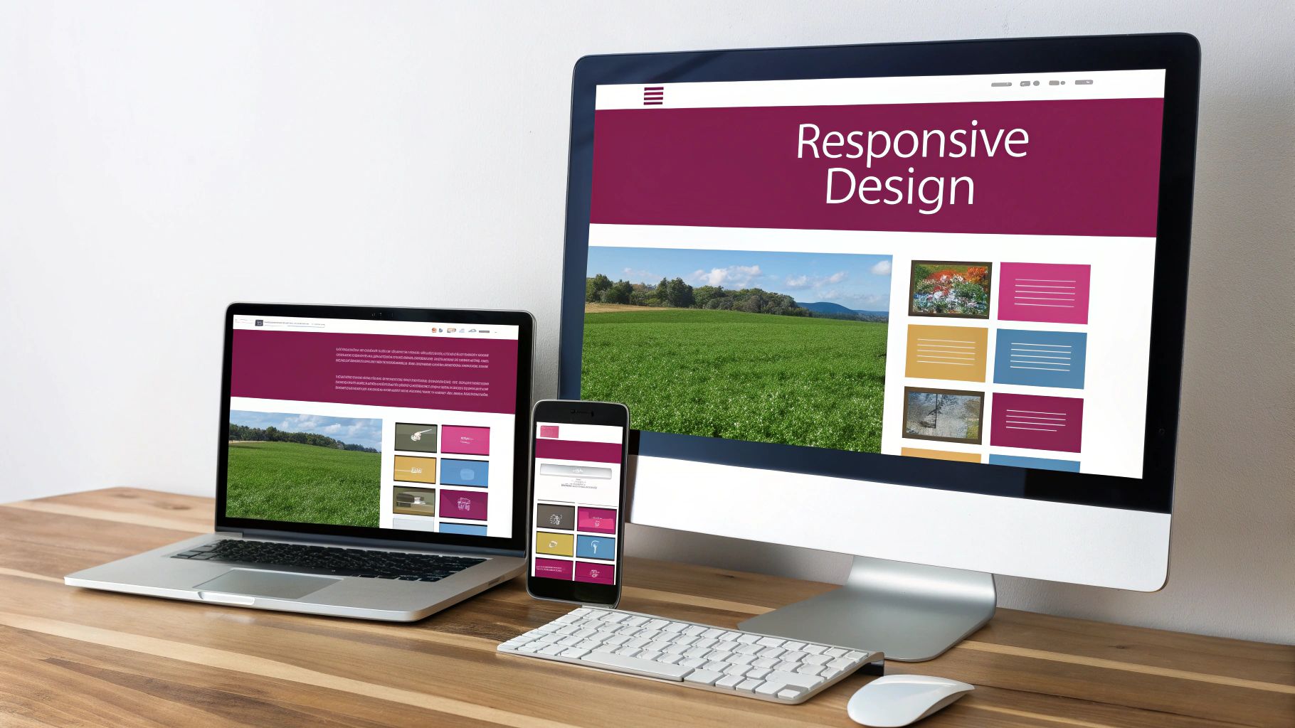
Picture a website that behaves like water, effortlessly taking the shape of whatever container it’s poured into—whether that’s a sprawling desktop monitor, a tablet, or the smartphone in your hand. That’s the essence of responsive web design. It’s a design philosophy that ensures your website looks great and works perfectly, no matter the device. Our dedicated team is here to help you harness this power for your business.
Why Your Website Must Be Responsive
A website that only looks good on a desktop is like a retail store that’s only open a couple of hours a day. You’re shutting the door on a huge number of potential customers. Navigating this challenge is our specialty, and we’re ready to offer actionable advice to get you on the right track.
Consider this: over 70% of e-commerce transactions now happen on mobile phones. If your site isn’t responsive, it’s not just a small inconvenience for visitors; it’s a direct path to frustration and lost sales. A responsive design is the key to connecting with your audience wherever they happen to be.
This approach makes sure every user has a smooth, positive experience. A responsive site automatically adjusts its layout, images, and text to fit the screen size. This prevents those all-too-common frustrations, like squinting to read tiny text, fumbling to tap impossible-to-reach buttons, or the endless pinch-and-zoom dance just to see what’s on the page.
The Foundation of a Modern Online Presence
Think of responsive design as the very foundation of your digital storefront. Without that solid base, everything else you build on top of it—your marketing campaigns, your content, your customer service—is on shaky ground. Our team can provide the professional advice you need to build this foundation correctly from the start.
A clunky mobile experience can send your bounce rate through the roof, tarnish your brand’s reputation, and even hurt your search engine rankings, since Google actively prioritizes mobile-friendly websites.
Building a truly responsive website is about more than just shrinking things down. It takes thoughtful planning to make sure the experience remains intuitive and easy to use on every screen. The core components include:
- Fluid Layouts: The site’s entire structure is flexible, stretching or contracting to fit the available space.
- Flexible Media: Images and videos scale down proportionally, so they never look stretched, squished, or broken.
- Smart Navigation: Menus adapt intelligently, often changing from a wide navigation bar on desktops to a compact “hamburger” icon on mobile devices.
A responsive design creates a seamless experience across all devices. It allows users to easily switch between the desktop and mobile versions of your site, building a consistent and trustworthy brand identity.
While responsive design is crucial, it’s just one piece of the puzzle. It works best when combined with other key website design best practices that contribute to a winning online presence.
Getting all of this right can feel overwhelming, but you don’t have to do it alone. Our team is here to offer professional advice and help turn these principles into a high-performing website for your business. If you’re ready to elevate your online presence, reach out for a free estimate and let’s build something great together.
Understanding The Core Pillars of Responsive Design
To really get what responsive web design is all about, we need to peek under the hood. It’s not magic; it’s a clever combination of three technical pillars working in harmony: fluid grids, flexible images, and media queries. Getting these three to play nicely together on every possible screen is where the expertise of a dedicated team really shines.
This visual helps illustrate how these principles stack up.
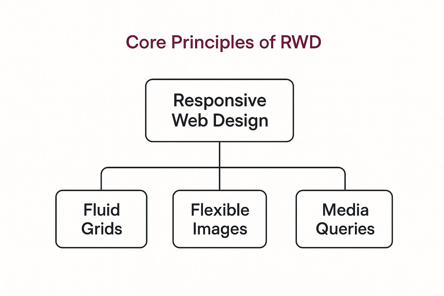
As you can see, these aren’t just separate ideas. They’re foundational building blocks that allow a single website to intelligently adapt to any device. Our team is ready to help you implement these for maximum impact.
The Foundation: A Fluid Grid
Remember the early days of the web? Websites were built like rigid boxes with fixed pixel widths. They looked fine on a desktop monitor, but on a smaller screen, you were stuck scrolling side-to-side just to read a sentence. It was a terrible experience.
A fluid grid is the complete opposite. Instead of a rigid box, think of your website’s layout as being made of stretchable fabric. Rather than defining columns and sections with fixed pixels, we use relative units like percentages. This means the layout elements can shrink or expand proportionally to fit whatever screen they’re on, killing that dreaded horizontal scrollbar for good.
This flexibility is the first and most important step, but it doesn’t solve the whole puzzle on its own, especially when it comes to images. For actionable advice on implementing this, our experts are just a call away.
Keeping Visuals Perfect with Flexible Images
Now, what about the images and videos inside that stretchy, fluid layout? If you just drop in a large, fixed-size photo, it’s going to break right out of its container on a small screen. The result is a chaotic mess that looks amateurish.
This is where the second pillar, flexible images, saves the day. We use a simple bit of code to tell every image that its maximum width can only be 100% of the container it sits in. As the fluid grid shrinks on a phone, the image scales down perfectly with it, maintaining its aspect ratio and looking sharp.
This one simple rule is the key to ensuring your visual branding stays crisp and professional on every device. It’s the difference between a site that looks polished and one with stretched or squished images that scream “poorly built.”
Properly handling images goes beyond just resizing, though. A massive desktop image that’s just shrunk down for mobile still has a huge file size, which can seriously slow your site down. Smart responsive design also involves optimizing images for performance—a crucial detail where our skills in load speed optimization can make a massive difference. Our dedicated team is ready to help you tackle this.
The Director: Media Queries
So, we have a layout that stretches and images that scale. That’s great, but it’s still a bit dumb. The layout doesn’t know when it needs to make more significant changes. A three-column design might look fantastic on a laptop, but when squished onto a phone, it becomes a cramped, unreadable mess.
Media queries are the brains of the operation. They act like a director, checking the device’s properties and making decisions based on them. They ask simple questions:
- What’s the exact width of the screen?
- Is the phone being held in portrait or landscape mode?
- What’s the screen resolution?
Based on the answers, media queries apply specific style rules. For example, a media query can tell the browser, “If the screen is less than 768 pixels wide, switch from three columns to a single, stacked column.” This ensures your content is always presented in the most logical and user-friendly way for that particular device.
To recap these three key technologies, here’s a quick breakdown of how they work together.
Core Components of Responsive Web Design
| Component | Primary Function | Analogy |
|---|---|---|
| Fluid Grid | Creates a flexible layout using relative units like percentages, allowing the structure to adapt to different screen sizes. | A container made of stretchable fabric that expands or contracts to fit its contents. |
| Flexible Images | Ensures images scale down proportionally within their containers, preventing them from breaking the layout. | A photograph printed on a rubber sheet that shrinks without distorting the picture. |
| Media Queries | Applies different CSS rules based on device characteristics (like width or orientation) to make significant layout changes. | A director who tells the actors (content) how to rearrange themselves on different stage sizes. |
Mastering the interplay between these three pillars is what separates a truly responsive website from one that just sort of works. If you’re looking for professional advice on this, our team is ready to help you achieve a seamless result across the board.
Why Responsive Design Is a Business Necessity
Let’s be clear: responsive design isn’t just a nice-to-have feature anymore. It’s a core business strategy, and one with a serious return on investment. The choice to go responsive directly shapes your bottom line, starting with that all-important first impression.
Think about it. When a potential customer finds you—whether on their work laptop or their phone while commuting—a seamless experience builds instant trust. A site that just works everywhere sends a powerful message: you’re professional, you’re reliable, and you care about their experience. It’s what convinces them to stick around. Our dedicated team can help you send that message loud and clear.

Unlocking Visibility with Mobile-First Indexing
If there’s one reason to prioritise responsive design, it’s how much Google cares about it. The search engine giant now runs on “mobile-first indexing,” which means it primarily uses the mobile version of your website to understand and rank your content.
If your site is a mess on mobile—or doesn’t even have a mobile version—Google’s crawlers will struggle. That struggle translates directly into lower rankings, effectively making you invisible to the huge number of people searching from their phones. Getting this right is a huge part of our search engine optimization strategy. We’re here to help you navigate this.
In simple terms, if your website isn’t responsive, you’re not just offering a bad user experience—you’re actively damaging your ability to be found on Google. It’s no longer an option, but a requirement for modern online visibility.
Driving Conversions and Boosting Engagement
A great user experience is directly linked to better conversion rates. It’s common sense, really. When someone can easily browse your site, read your content, and make a purchase or fill out a form on their phone, you’ve removed all the frustrating barriers that make people give up. That smooth process is what turns a casual visitor into a paying customer.
The data tells the same story. One business that switched to a fully responsive site saw its mobile keyword visibility jump by 300% in just 60 days. Even better, their bounce rates dropped by a massive 40%, and mobile conversions nearly doubled. These aren’t vanity metrics; they show a direct line between a responsive layout and real business growth. Our team is ready to help you achieve these kinds of results.
This isn’t just about looking good. It’s about improving the numbers that matter:
- Reduced Bounce Rates: People don’t immediately leave when a site loads and works properly on their device.
- Increased Time on Page: An easy-to-read, intuitive layout encourages users to explore your content more deeply.
- Higher Conversion Rates: A frustration-free path from discovery to action means more sales and more leads. Simple as that.
A Smart Investment for Future Growth
Ultimately, putting resources into responsive design is an investment in your company’s long-term health. It ensures you can reach your customers wherever they are today and prepares you for the endless variety of new devices coming tomorrow. Plus, building one flexible website is far more cost-effective and simpler to manage than trying to juggle separate desktop and mobile sites.
While the idea is straightforward, getting the execution right across every single device takes real expertise. Our team is here to guide you through it. Reach out for a free, no-obligation estimate, and let’s talk about what a professionally built responsive website can do for your business.
How to Implement Responsive Design Effectively
Knowing what responsive web design is and why it matters is one thing. Actually putting those ideas into practice is a whole different ball game. While the core concepts sound simple, getting the execution right requires a careful, strategic approach. We’re here to provide actionable insights to help you avoid the common pitfalls that can sink a user’s experience and your search rankings.

Think of this section as your roadmap. We’re not just talking about making a website shrink to fit a screen; we’re talking about building something that intelligently adapts to give every visitor the best possible experience, no matter what device they’re using. Our dedicated team is ready to help you build it.
Champion the Mobile-First Approach
If there’s one golden rule in modern web design, it’s this: go mobile-first. Instead of building a big, complicated desktop site and then trying to figure out how to squeeze it onto a phone, you start with the smallest screen and build up from there.
This simple shift in thinking forces you to prioritise what truly matters—the essential content and features. Starting with mobile constraints naturally leads to a cleaner, faster, and more focused design. Once that solid foundation is in place, you can then progressively add more complex elements and features as you scale up for tablets and desktops. For professional advice on this strategy, just reach out.
Prioritize Performance and Speed
On a mobile device, speed isn’t a feature; it’s a necessity. Users have zero patience for slow-loading pages, and search engines feel the same way. Performance is a cornerstone of good responsive design, and our team is ready to help you optimize it.
- Optimize Your Images: Huge image files are the number one cause of sluggish websites. You need to compress them without losing quality, use modern formats like WebP, and use lazy loading so images only load as the user scrolls to them.
- Minimize Your Code: Every line of code adds weight. Keep your HTML, CSS, and JavaScript as lean as possible by removing unnecessary scripts and consolidating files. A tidier codebase is a faster codebase.
- Leverage Browser Caching: Caching tells a user’s browser to save parts of your site, like your logo and navigation. When they come back, the site loads almost instantly because those assets are already stored locally.
A mobile-first mindset inherently leads to a faster website for everyone. By optimizing for the most restrictive environment first, you create a high-performance baseline that benefits users on all devices, from phones to high-speed desktop connections.
Focus on a Touch-Friendly User Experience
You use a website with your fingertips on a phone, not a precise mouse cursor. It’s a completely different way of interacting, and your design has to reflect that. A site that isn’t built for touch will feel awkward and frustrating to use. Here’s our advice for getting it right:
- Create Large Touch Targets: Every button, link, and menu item needs to be big enough to tap easily without hitting the wrong thing. A good rule of thumb is a target size of at least 44 by 44 pixels.
- Ensure Readable Typography: No one wants to pinch and zoom just to read your content. Use flexible font sizes that scale with the screen and make sure your text has plenty of contrast against the background colour.
- Simplify Navigation: Those massive, multi-level menus from desktop sites are a disaster on mobile. Opt for a simple, intuitive solution like the classic “hamburger” menu to keep the interface uncluttered.
Getting these details right can be tricky. For a deeper dive into making your site accessible and user-friendly on all devices, these 9 responsive design best practices are a great resource.
Perfecting a responsive design is where real expertise comes in. Our team knows how to handle these technical nuances to deliver a seamless, high-performing website that your audience will love. If you want to ensure it’s done right, reach out for professional advice and a free estimate—we’re here to help.
Seeing Responsive Design in the Wild: Real-World Examples
Theory is one thing, but seeing responsive design work in practice is where it all clicks. It’s easy to talk about fluid grids and media queries, but how do these concepts actually come together on a real website? Let’s break down a great example to see how the pros do it.
This isn’t just about shrinking a website to fit a smaller screen. It’s about a thoughtful, strategic reimagining of the user experience for different contexts. Our team is dedicated to creating these tailored experiences for our clients.
A Masterclass in Action: The Verge
The tech news site, The Verge, is a textbook example of responsive design done right. Their homepage is packed with content—articles, reviews, videos—and it needs to be just as engaging on a huge desktop monitor as it is on a tiny phone screen. That’s no easy task, but they nail it.
On a desktop, you get a sprawling multi-column layout that showcases a ton of content at once. It feels immersive and encourages exploration.
But pull up that same URL on your phone, and the whole thing elegantly refolds itself into a single, clean column. The clutter is gone. Readability and easy scrolling become the main focus, which is exactly what a mobile user needs.
What Makes It Work So Well?
The magic is in how seamlessly the site transitions between these different views. Take the navigation. The complex, category-filled menu you see on a desktop cleverly tucks itself away into a “hamburger” icon on mobile. This simple move cleans up the entire interface without sacrificing access to any part of the site.
This isn’t just about looking good; it has a massive impact on the bottom line. Think about it: 94% of users say their first impression of a site is based on design. A clunky mobile experience is an instant turn-off. On the flip side, getting it right can boost conversion rates by up to 200%. That’s the power of building trust and providing a smooth user journey, no matter the device. You can find more data on how design impacts California brands on digitalsilk.com.
A truly great responsive design doesn’t just adapt its layout; it rethinks the user’s priorities. On mobile, it emphasizes quick access to content and clear calls-to-action, recognizing that a mobile user’s context and needs are often different from a desktop user’s.
Your Roadmap to a Flawless Responsive Site
Achieving this level of polish isn’t something you can get from an off-the-shelf template. It requires a deep understanding of how people actually use different devices. The goal is to make the experience feel custom-built for every screen, from the smallest phone to the largest monitor. It’s that obsessive attention to detail that separates the good sites from the great ones.
Our team specializes in turning these best practices into real-world results. We dive into your content, get to know your audience, and build a responsive site that doesn’t just look amazing but also works perfectly everywhere.
If you’re ready to give every visitor an incredible experience, we’re here to help. Reach out today for a free estimate and get some professional advice on how we can build a responsive website that truly delivers.
Your Questions About Responsive Design, Answered
When you start digging into responsive web design, a few questions always pop up. We hear them all the time from our clients, so we’ve put together some straight-to-the-point answers to help you get a clearer picture of how it all works. Our team is always ready to provide professional advice on these topics.
What’s the Real Difference Between Responsive and Adaptive Design?
This one comes up a lot. The easiest way to think about it is that responsive design is like a single website built from a flexible, liquid-like material. It smoothly stretches and shrinks to fit any container—or screen—you pour it into.
Adaptive design, on the other hand, is more like having a few different-sized solid containers. The system detects the device and serves up the pre-set layout that’s the closest fit. While it works, responsive is generally the go-to choice because it’s more versatile and ready for any new device the future might throw at us. We can help you decide which approach is best for your specific needs.
How Long Does It Actually Take to Build a Responsive Site?
That’s the million-dollar question, and the honest answer is: it depends entirely on what you’re building. A simple, elegant website for a local business might be ready to go in just a few weeks. But if you’re looking at a sprawling e-commerce site with thousands of products and custom features, you’re likely looking at a multi-month project.
Every project has its own unique needs and goals, which is why a blanket timeline just doesn’t work. This is exactly why we offer a free, no-obligation estimate. It gives us a chance to understand what you want to achieve and give you a realistic timeline.
Is Responsive Design a Major Expense?
It’s better to think of responsive design as a smart investment rather than a cost. Think about it: creating and managing one brilliant website that works everywhere is significantly more cost-effective than juggling separate desktop and mobile sites.
The return on that investment shows up pretty quickly. For example, did you know that in local eCommerce, mobile users on responsive sites convert at a rate 2.5 times higher than on non-responsive ones? That’s a direct line to more revenue. You can dive deeper into the eCommerce platform statistics for California on digitalsilk.com.
When you factor in the perks like better search engine rankings, higher conversion rates, and happier users who stick around longer, it becomes one of the most valuable moves you can make online. Our team is always here to offer professional advice to help you get started.
Ready to Make Your Website Truly Responsive?
So, you’ve seen what responsive design is all about—how it works, and why it’s absolutely essential for any business with a website. The theory is great, but now it’s time for the actionable step. The first, simplest suggestion? Pull out your phone, grab a tablet, and look at your own website. Does it hold up?
If you find yourself pinching, zooming, or struggling to click a button, that’s your sign. It’s a clear signal that your site isn’t delivering the best possible experience, and that’s something you can’t afford to ignore. Our dedicated team is ready to help you fix it.
We’re here to take the technical headaches out of responsive design. Our job is to build you a seamless, high-performing website that meets your business goals, letting you focus on what you do best.
Whether you’re looking to overhaul your current site or build a brand new one from scratch, our expertise in professional website design ensures your digital storefront is polished and practical for every visitor. It’s all about creating a site that just works, no matter what device it’s viewed on.
Don’t let a clumsy mobile experience get in the way of your growth. Reach out to our team for a free, no-obligation estimate and some straight-up professional advice. Let’s build a website that works for everyone.
Ready to grow your business with a stunning, fully responsive website? Contact Sugar Design Group today at https://www.sugardesigngroup.com.